A glow-up digital experience for devoted fur parents
😀 Alert: We're heading back to the year 2000! Skip if you're
not feeling adventurous.
A glow-up digital experience
for devoted fur parents
😀 Alert: We're heading back to the year 2000! Skip if you're
not feeling adventurous.
Industry
Industry
eCommerce
eCommerce
Business goal
Business goal
Responsive website re-design, Improved web experience.
Heuristic evaluation
Visual system
Responsive website re-design, Improved web experience. Heuristic evaluationVisual system
Lead time
Lead time
December 2021
December 2021
Service
Service
UI,Wireframing, Prototype, CMS,Landing page
UI,Wireframing, Prototype, CMS,Landing page
Tool stack
Adobe XD
Figma
Skype
Platforms
Platforms
Desktop,
Mobile,
Laptops
Desktop,
Mobile,
Laptops
Squad
Squad
Project manager(1)
UX engineers(2)
Designers(ME)
Project manager(1)
UX engineers(2)
Designers(ME)
PDLC
PDLC
Meeting with PM
Consultation
Usability studies
Design thinking
First draft
Feedback
handoff
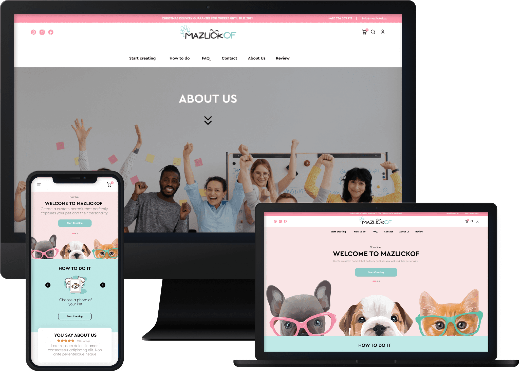

Followed Old UX design patterns, kept Usability & accessibility top priority
Followed Old UX design patterns, kept Usability & accessibility top priority
Meet Mazlickof, your go-to destination for delightful custom pet portraits! Dive into the joy of personalized artwork for your furry pals on our easy-to-navigate online platform.
Meet Mazlickof, your go-to destination for delightful custom pet portraits! Dive into the joy of personalized artwork for your furry pals on our easy-to-navigate online platform.
Goal
Goal
→ Totally refined custom portrait input experience
→ Boost organic traffic.
→ Implement a improved UI web version that generate leads.
→ Easy to navigate web experience.
→ Clear Call to actions and carousal visuals
→ Totally refined custom portrait input experience
→ Boost organic traffic.
→ Implement a improved UI web version that generate leads.
→ Easy to navigate web experience.
→ Clear Call to actions and carousal visuals
Challenge Accepted
Challenge Accepted
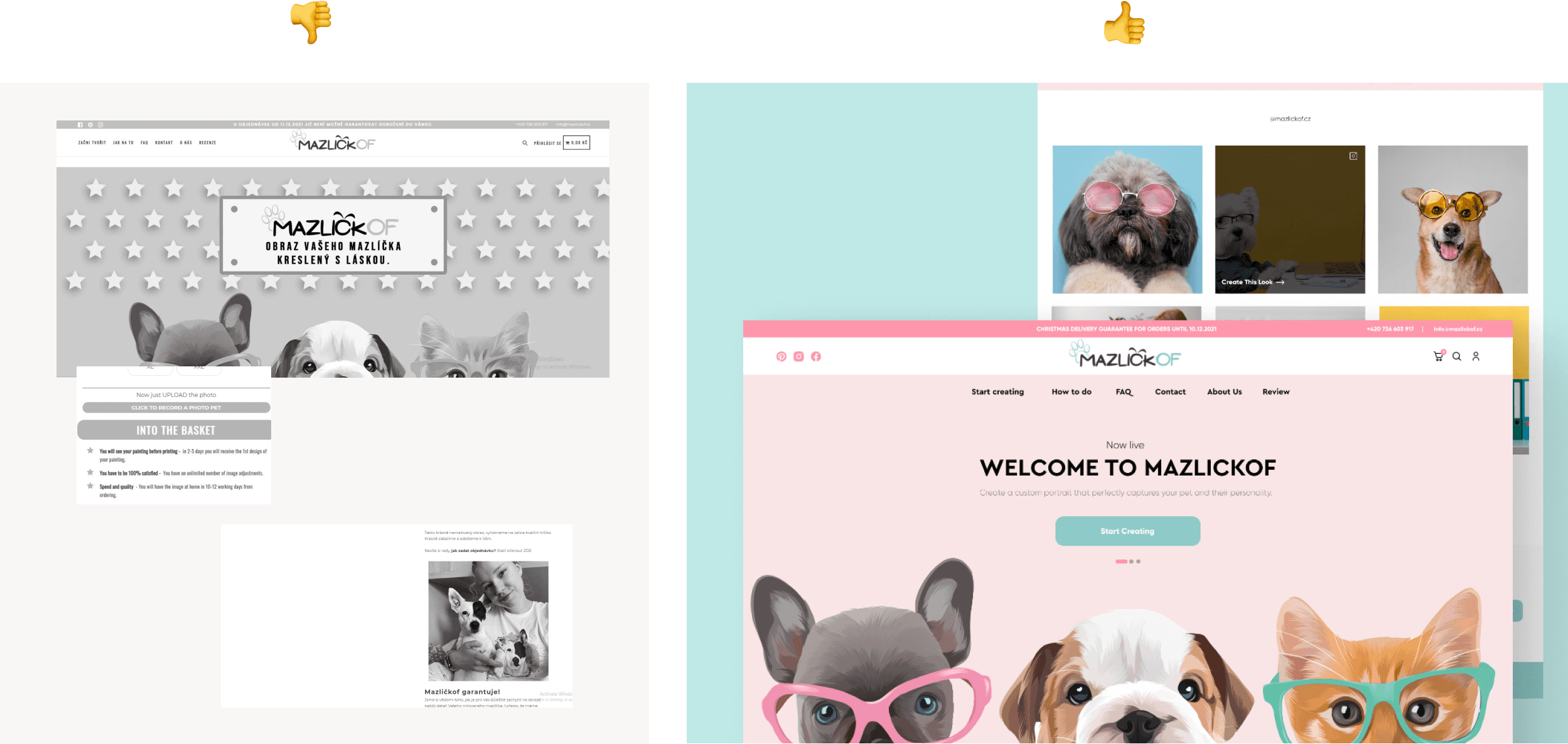

The Mazlickof website was in desperate need of a user experience facelift and some serious attention to detail. The existing version was a bit of a compromise – at first glance, it felt like a blast from the past, giving off some serious 70's vibes. The user journey was far from stellar, lacking any semblance of UX principles and a data-driven approach. It was high time for a transformation
Now, I have to be honest, their current website UI was a bit like a vintage find, but the UX was a tad confusing specially the PRODUCT / CUSTOMISE PORTRAIT PAGE – not the end of the world, but definitely not a walk in the park for users.
It was clear as day that a redesign was in order – something that not only met user needs but also brought a breath of fresh air to the interface. I mean, the current state of things was like a party no one wanted an invite to!
Now, here's where the plot thickens. Convincing them to embrace a whole new look with different branding and top-notch UX was a bit of a challenge. Mazlickof team dont know the consistancy and up-to-date photography, So there I tried, but they demanded almost what they have now.
They were on board, but with a twist – they just wanted a few touch-ups for now. Challenge accepted! I rolled up my sleeves to sprinkle some magic on their website, all while keeping their audience in mind.
Usability & Accessibility review
Usability & Accessibility review
Before jumping into the design fun, I took a deep dive into a full-on design audit. I went through every nook and cranny of the website pages, playing detective to spot areas where we could sprinkle some improvement magic.
Teaming up with the Product Owner (PO), we had our own little brainstorming party.
He did his thing with a heuristic review, and then, ta-da! We blended our insights to cook up some seriously improved solutions.
To give our ideas a test run, we roped in users for some friendly chat sessions and usability tests. Guess what? The cool part was that our suggestions lined up pretty darn well with the feedback we got from our awesome users. It's like we had a secret code for making things better!
Design thinking
Design thinking
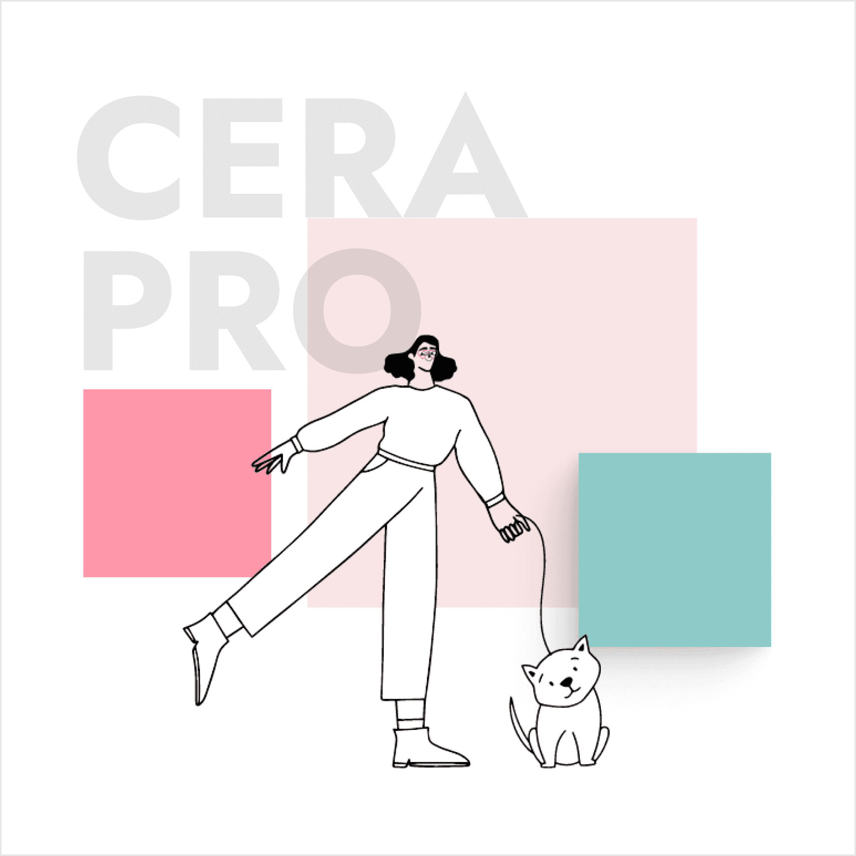

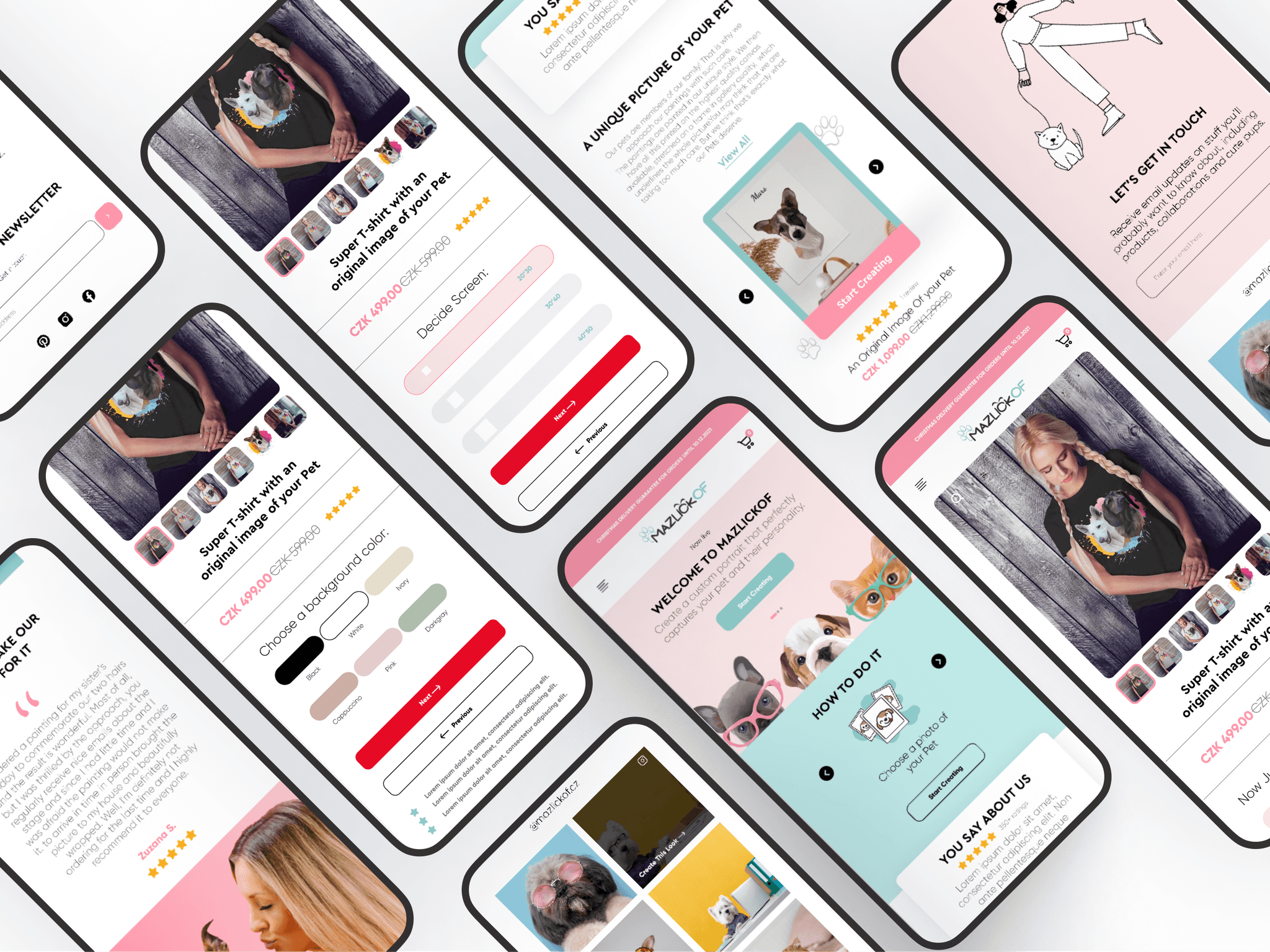
I decided to go with the same brandguidelines but with improved web UI.
After A-B testing of website with all examination of usability, accessibility I derived a brief where I included moodboards and overall planning of the website by keeping the responsiveness of website in mind.
Which include the following for in the UI phase:
→ Color mangement
→ Font and typefaces selection
→ Visualized images
→ Style guide sheet
Setting design foundation
Setting design foundation
Low fidelity Wire-frames
After brainstorming session
I dive into generating wireframes for the targeted web pages. The user journey I planned for this is typically involve conventions and includes less steps and clicks to reach the specific target.
The main pages we put our focus on are the following:
→ Category page
→ Custom portrait page
→ Landing page
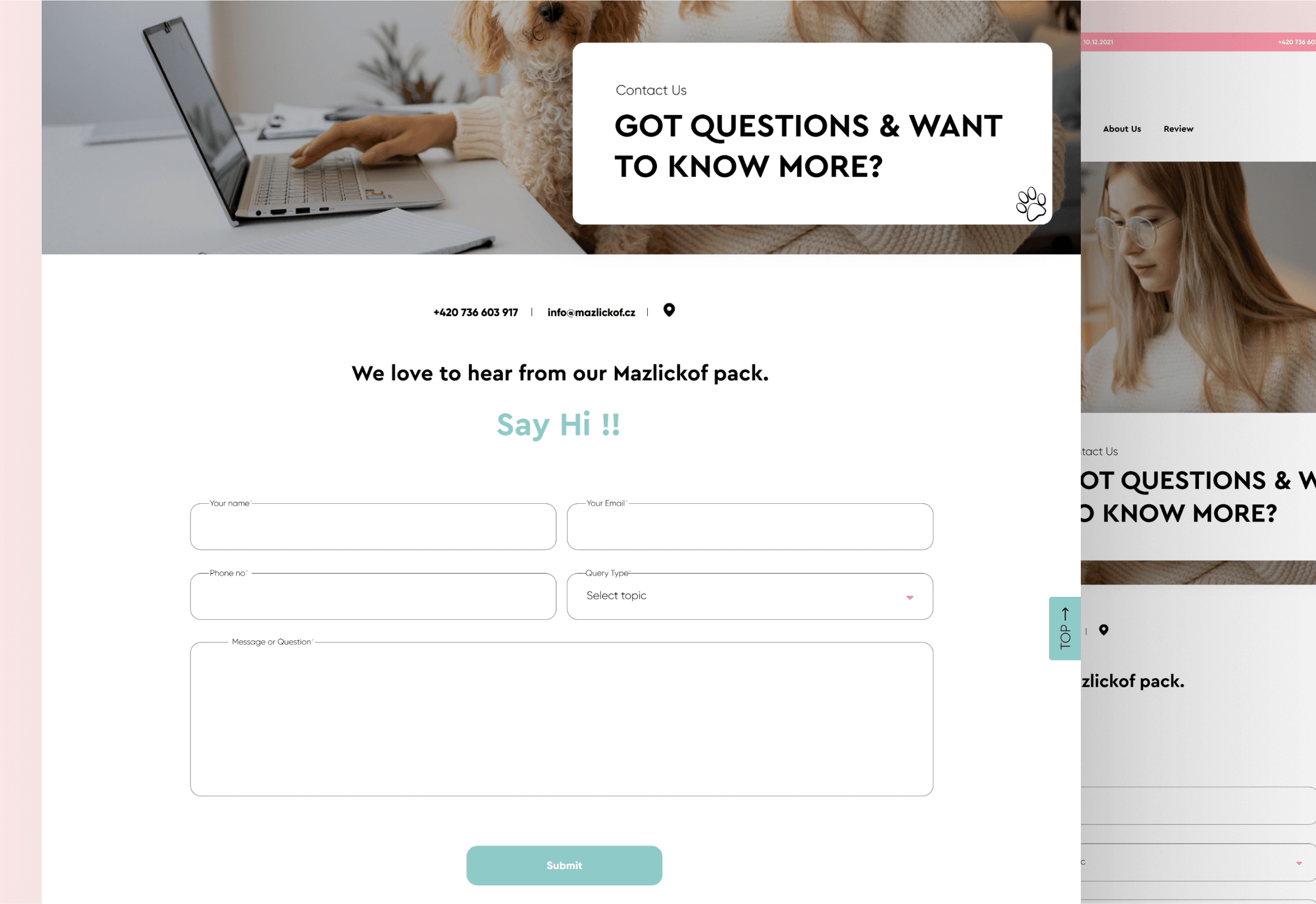
→ Contact page
→ Promotional content
Primary red button story vs improved product page
Primary red button story vs improved product page
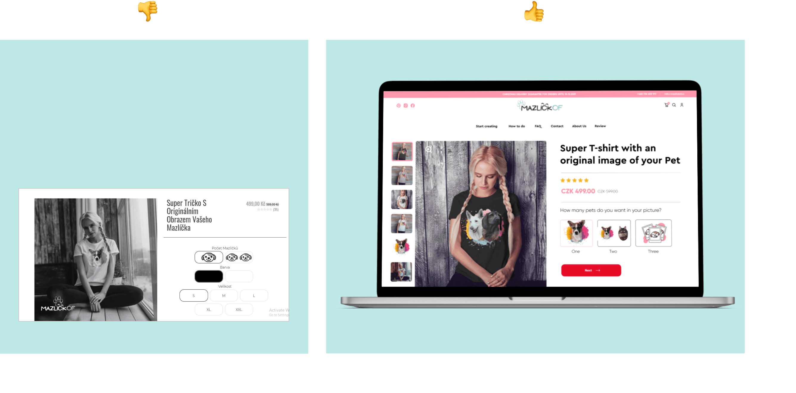

When I visited product page on their live website. It brought me horror There was a lot of usability issues I found. Which might lead user to stressout and immediately leave the website and move to another in the market. As Typography, Alignments, Contrast(Accessibility) these all plays pivot role to successful product and its user journey.
When I visited product page on their live website. It brought me horror There was a lot of usability issues I found. Which might lead user to stressout and immediately leave the website and move to another in the market. As Typography, Alignments, Contrast(Accessibility) these all plays pivot role to successful product and its user journey.


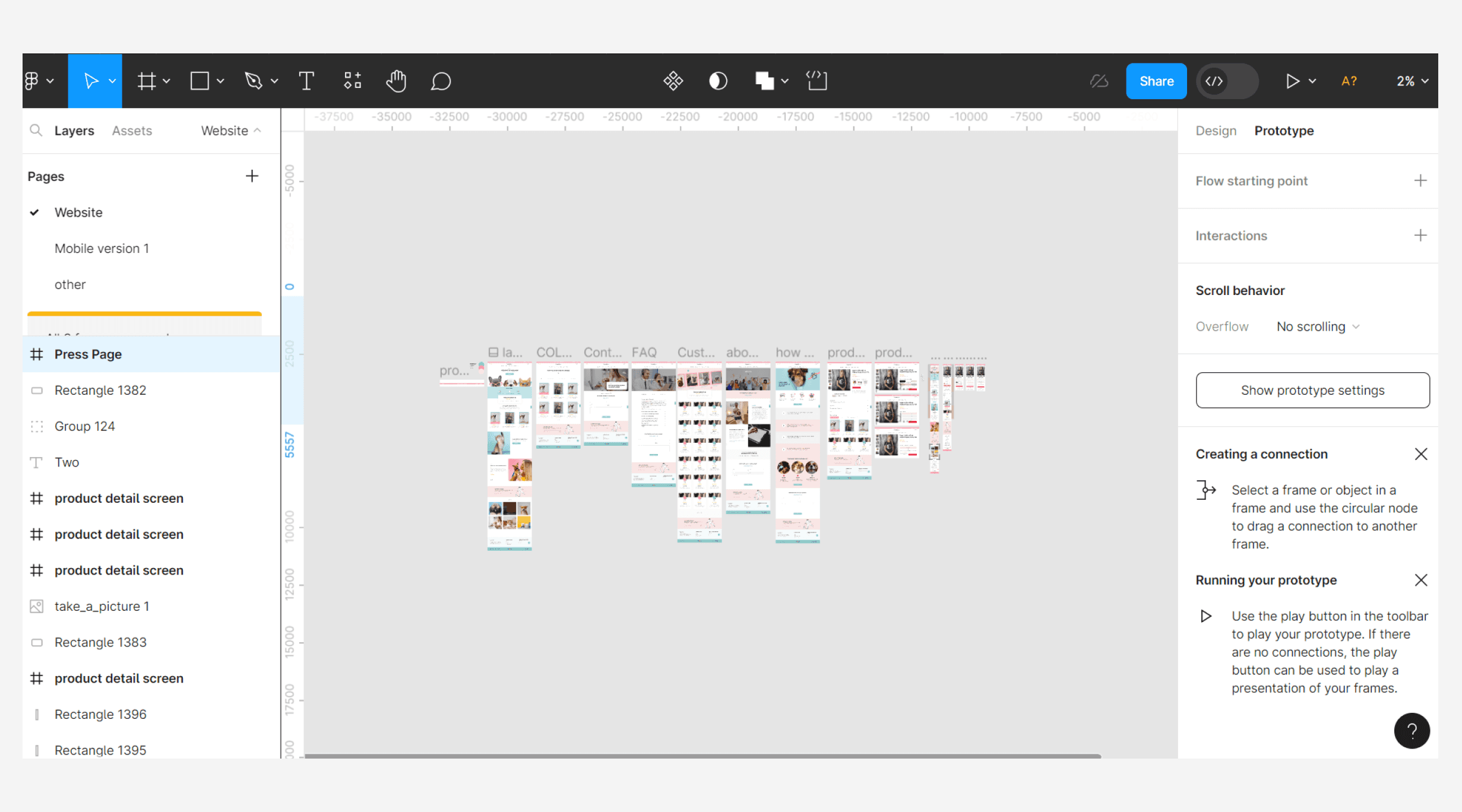

Design handoffs
Following the completion of the UI/UX design elements for Mazlickof, the next crucial step involved a smooth handoff to our development team. This was done to ensure seamless transition and clear communication throughout the process.
Design handoffs
Following the completion of the UI/UX design elements for Mazlickof, the next crucial step involved a smooth handoff to our development team. This was done to ensure seamless transition and clear communication throughout the process.
What I’ve learned
What I’ve learned
Navigating the conversation about prioritizing design principles over other factors with a client can be a bit of a challenge. Yet, it's an interesting journey to highlight how these principles can truly elevate their project
So it's essential to understand their needs while gently suggesting improvements by focusing on enhancing web presence by finding a balance between old conventions and fresh ideas.